Featured Articles

In today’s competitive world, one must be knowledgeable about the latest online bus...
Oct 12, 2018
With the ever-growing B2B arena, there's no denying the transformative role of data-driven decision-making.
With the daily inundation of raw data, the need for actionable insights provided by data visualization software has never been more paramount. But what sets this software apart from other tools? How does it cater to this overarching need for clarity amidst data complexity?
And most importantly, what is data visualization, and how does it bridge this gap?
The Problem with Raw Data in Business Intelligence (BI)
Consider XYZ Corp., a rising B2B firm. With advanced business intelligence data visualization tools, they were poised to lead their market. However, their teams were still wrestling with sheets of raw data, trying to get across actionable insights. Despite having top-notch tools, the lack of effective visualization resulted in cognitive overload, time wastage, and rising risks of errors.
Understanding Data Visualization in BI
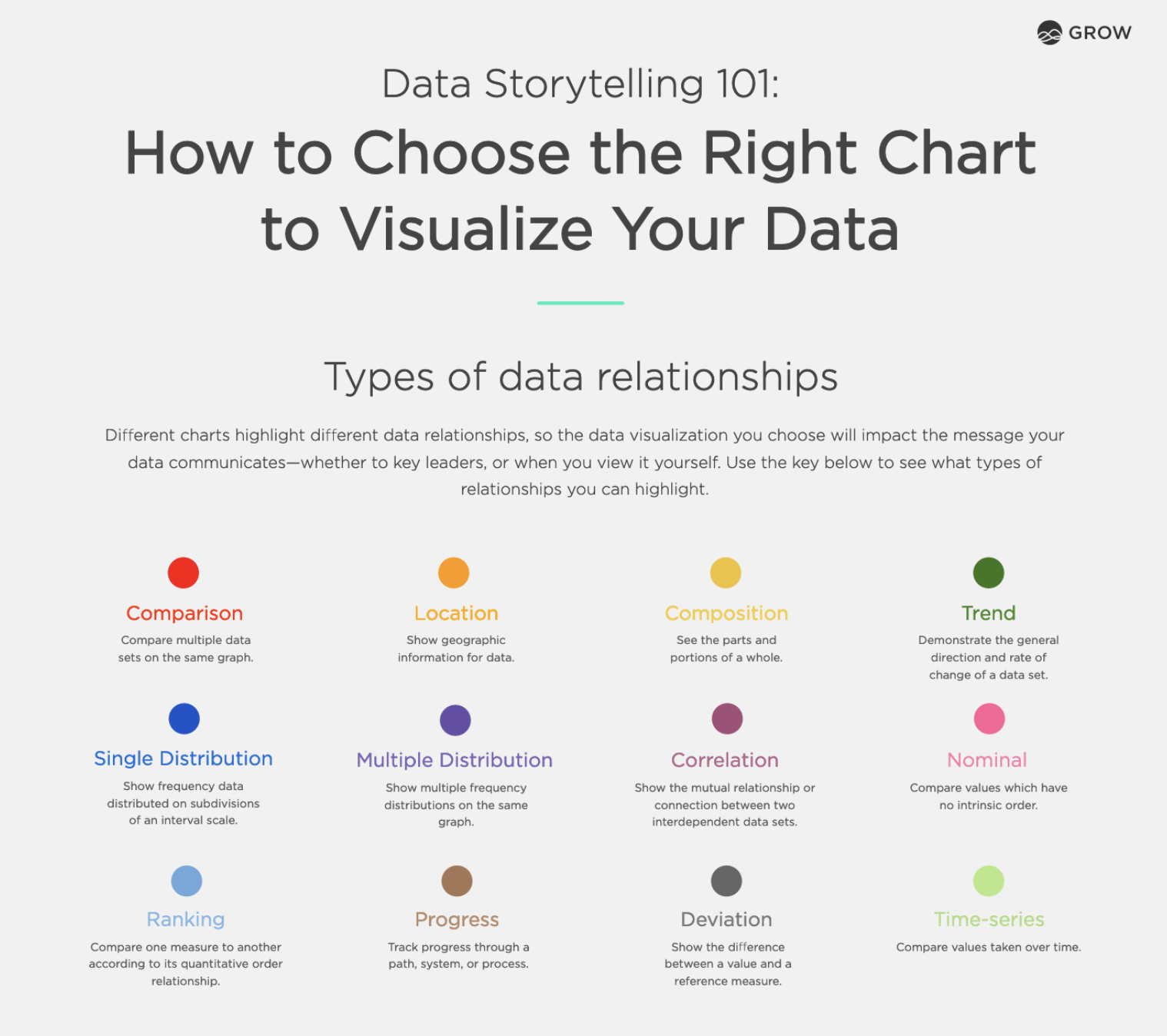
To put it simply, data visualization is the use of graphics to show information and data. Through visual elements like charts, graphs, and maps, data visualization software allows our brains to view and process complex quantities of data quickly and efficiently. Renowned BI tools like Tableau, PowerBI, and Grow champion this by turning vast data arrays into insightful, comprehensible visuals.
Tangible Benefits of Data Visualization for B2B Operations
In the intricate web of B2B operations, every decision holds weight. Efficiency in decision-making can be the key difference between a successful venture and a missed opportunity. Integrating data visualization into the decision-making process has tangible benefits, with a spotlight on the surprising efficiency of decision efficiency by up to 50%. Let’s delve deeper into this:
- Swift Interpretation of Data: Before the adoption of data visualization software, B2B teams often spent countless hours analyzing rows and columns of data. With visuals, however, complex data sets are translated into comprehensible graphics, enabling businesses to recognize patterns, trends, and anomalies in a fraction of the time. This newfound speed is a significant contributor to that 50% improvement.
- Reduced Cognitive Load: Our brains are naturally more attuned to processing visuals over textual or numeric data. By representing data graphically, there's less cognitive strain on decision-makers. They can get to the crux of the matter rapidly without being overwhelmed by raw data. This ease boosts decision-making efficiency as teams spend less time understanding the data and more time strategizing around it.
With the ever-growing B2B arena, there's no denying the transformative role of data-driven decision-making.
With the daily inundation of raw data, the need for actionable insights provided by data visualization software has never been more paramount. But what sets this software apart from other tools? How does it cater to this overarching need for clarity amidst data complexity?
And most importantly, what is data visualization, and how does it bridge this gap?
The Problem with Raw Data in Business Intelligence (BI)
Consider XYZ Corp., a rising B2B firm. With advanced business intelligence data visualization tools, they were poised to lead their market. However, their teams were still wrestling with sheets of raw data, trying to get across actionable insights. Despite having top-notch tools, the lack of effective visualization resulted in cognitive overload, time wastage, and rising risks of errors.
Understanding Data Visualization in BI
To put it simply, data visualization is the use of graphics to show information and data. Through visual elements like charts, graphs, and maps, data visualization software allows our brains to view and process complex quantities of data quickly and efficiently. Renowned BI tools like Tableau, PowerBI, and Grow champion this by turning vast data arrays into insightful, comprehensible visuals.
Tangible Benefits of Data Visualization for B2B Operations
In the intricate web of B2B operations, every decision holds weight. Efficiency in decision-making can be the key difference between a successful venture and a missed opportunity. Integrating data visualization into the decision-making process has tangible benefits, with a spotlight on the surprising efficiency of decision efficiency by up to 50%. Let’s delve deeper into this:
- Swift Interpretation of Data: Before the adoption of data visualization software, B2B teams often spent countless hours analyzing rows and columns of data. With visuals, however, complex data sets are translated into comprehensible graphics, enabling businesses to recognize patterns, trends, and anomalies in a fraction of the time. This newfound speed is a significant contributor to that 50% improvement.
- Reduced Cognitive Load: Our brains are naturally more attuned to processing visuals over textual or numeric data. By representing data graphically, there's less cognitive strain on decision-makers. They can get to the crux of the matter rapidly without being overwhelmed by raw data. This ease boosts decision-making efficiency as teams spend less time understanding the data and more time strategizing around it.
- Enhanced Collaboration: With a data visualization dashboard, businesses have seen a surge in collaboration efficiency. When visuals are employed, teams across departments find it easier to align on data interpretation. This shared understanding accelerates collaborative decisions, further contributing to the 50% enhancement in efficiency.
- Mitigation of Errors: In the world of raw data, misinterpretation is a frequent menace. However, data visualization offers clarity. When data is visual, errors arising from misunderstanding or oversights reduce substantially. Better accuracy means decisions are not just faster but also more reliable, reinforcing the boost in efficiency.
- Actionable Insights at Forefront: Data visualization software doesn't just display data; it prioritizes it. Crucial metrics and KPIs can be highlighted, ensuring that decision-makers focus on the most critical data points. This prioritization ensures that decisions are not just quicker but are centered around actionable insights, amplifying their effectiveness.
- Feedback Loop Efficiency: Modern data visualization dashboards are interactive. They allow decision-makers to tweak variables and see potential outcomes. This feedback loop, where one can witness the repercussions of potential decisions, ensures that when a choice is made, it’s backed by foresight and understanding. This predictive edge is pivotal in ramping up decision efficiency.
RedShelf's Transformation: A Data Visualization Case Study
Founded in 2011, RedShelf set out with a vision to simplify the sharing and acquisition of digital content. Despite their innovative approach, they found themselves drowning in data, as noted by CFO & Co-Founder Tim Haitaian, who recalls the complexity of managing their expansive ebook store and the scattered nature of their data. Their in-house attempts at data visualization fell short.
Their game-changer? Grow. Described by Haitaian as "low cost and very useful," Grow unified RedShelf’s fragmented data. With immediate access to visualized data, such as revenue figures and sales pipelines, the entire company became data-driven.
The benefits were multifold:
- Unified Data Source: A "singular source for information" made decision-making faster and more accurate.
- Empowered Employees: With data readily accessible via Grow dashboards, employees could autonomously derive insights, reducing daily queries.
- Holistic Business Understanding: Grow's holistic overview enabled the RedShelf team to understand the underlying mechanisms of their business truly.
Haitaian's sentiment encapsulates their transformation: "Grow has made us all more aware of what’s actually happening within our business.
Best Practices for Implementing Data Visualization in B2B Settings
While integrating business intelligence data visualization, it's imperative to:
- Identify relevant data subsets for visualization.
- Marry aesthetics with functionality, ensuring the visuals are comprehensible.
- Refresh visual data in real-time or near-real-time to keep it relevant.
- Always prioritize data security, especially when disseminating visuals externally.
ROI Calculations: Measuring the Impact
The proof is always in the pudding. By setting clear KPIs, businesses can easily gauge the ROI from their data visualization software investments. For instance, a company's ROI could be measured by the time saved in decision-making processes or by the increase in profitable decisions made post-implementation versus prior.
Overcoming Potential Roadblocks
There exist misconceptions that data visualization is merely "pretty charts." Businesses must educate teams on the functional merits of visualization, invest in adequate training, and be proactive about data quality. As the saying goes, "Garbage in, garbage out."
Looking Ahead: The Future of Data Visualization in BI
The future is rife with potential. With predictive analytics, AI integrations, and real-time visualization on the horizon, businesses must remain adaptable. Additionally, with technological innovations like AR and VR, envisioning a future where BI is not just on screens but all around us isn't far-fetched.
Conclusion
Making the shift from raw, unorganized data to clear, actionable insights can be the game-changing move your business needs. If you're intrigued by RedShelf's transformation and are contemplating whether Grow is the right fit for your business, don't just take our word for it. Explore Grow Reviews Cost & Features GetApp and discover firsthand the compelling difference it can make.
Ready to harness the power of business intelligence data visualization? Get started with your Grow journey today.
- Enhanced Collaboration: With a data visualization dashboard, businesses have seen a surge in collaboration efficiency. When visuals are employed, teams across departments find it easier to align on data interpretation. This shared understanding accelerates collaborative decisions, further contributing to the 50% enhancement in efficiency.
- Mitigation of Errors: In the world of raw data, misinterpretation is a frequent menace. However, data visualization offers clarity. When data is visual, errors arising from misunderstanding or oversights reduce substantially. Better accuracy means decisions are not just faster but also more reliable, reinforcing the boost in efficiency.
- Actionable Insights at Forefront: Data visualization software doesn't just display data; it prioritizes it. Crucial metrics and KPIs can be highlighted, ensuring that decision-makers focus on the most critical data points. This prioritization ensures that decisions are not just quicker but are centered around actionable insights, amplifying their effectiveness.
- Feedback Loop Efficiency: Modern data visualization dashboards are interactive. They allow decision-makers to tweak variables and see potential outcomes. This feedback loop, where one can witness the repercussions of potential decisions, ensures that when a choice is made, it’s backed by foresight and understanding. This predictive edge is pivotal in ramping up decision efficiency.
RedShelf's Transformation: A Data Visualization Case Study
Founded in 2011, RedShelf set out with a vision to simplify the sharing and acquisition of digital content. Despite their innovative approach, they found themselves drowning in data, as noted by CFO & Co-Founder Tim Haitaian, who recalls the complexity of managing their expansive ebook store and the scattered nature of their data. Their in-house attempts at data visualization fell short.
Their game-changer? Grow. Described by Haitaian as "low cost and very useful," Grow unified RedShelf’s fragmented data. With immediate access to visualized data, such as revenue figures and sales pipelines, the entire company became data-driven.
The benefits were multifold:
- Unified Data Source: A "singular source for information" made decision-making faster and more accurate.
- Empowered Employees: With data readily accessible via Grow dashboards, employees could autonomously derive insights, reducing daily queries.
- Holistic Business Understanding: Grow's holistic overview enabled the RedShelf team to understand the underlying mechanisms of their business truly.
Haitaian's sentiment encapsulates their transformation: "Grow has made us all more aware of what’s actually happening within our business.
Best Practices for Implementing Data Visualization in B2B Settings
While integrating business intelligence data visualization, it's imperative to:
- Identify relevant data subsets for visualization.
- Marry aesthetics with functionality, ensuring the visuals are comprehensible.
- Refresh visual data in real-time or near-real-time to keep it relevant.
- Always prioritize data security, especially when disseminating visuals externally.
ROI Calculations: Measuring the Impact
The proof is always in the pudding. By setting clear KPIs, businesses can easily gauge the ROI from their data visualization software investments. For instance, a company's ROI could be measured by the time saved in decision-making processes or by the increase in profitable decisions made post-implementation versus prior.
Overcoming Potential Roadblocks
There exist misconceptions that data visualization is merely "pretty charts." Businesses must educate teams on the functional merits of visualization, invest in adequate training, and be proactive about data quality. As the saying goes, "Garbage in, garbage out."
Looking Ahead: The Future of Data Visualization in BI
The future is rife with potential. With predictive analytics, AI integrations, and real-time visualization on the horizon, businesses must remain adaptable. Additionally, with technological innovations like AR and VR, envisioning a future where BI is not just on screens but all around us isn't far-fetched.
Conclusion
Making the shift from raw, unorganized data to clear, actionable insights can be the game-changing move your business needs. If you're intrigued by RedShelf's transformation and are contemplating whether Grow is the right fit for your business, don't just take our word for it. Explore Grow Reviews Cost & Features GetApp and discover firsthand the compelling difference it can make.
Ready to harness the power of business intelligence data visualization? Get started with your Grow journey today.
Article source: https://article-realm.com/article/Business/49819-Boosting-ROI-How-Data-Visualization-Enhances-Decision-Efficiency-by-50.html
Comments
Reviews

Most Recent Articles
- Oct 24, 2026 Study Business Analytics in Vietnam: Scope, Top Universities, Fees & Career Prospects by Mahesh Mysto
- Oct 23, 2026 AI-Powered Healthcare Imaging in 2026: How Computer Vision Is Transforming Medical Diagnostics by HyprForge
- Oct 23, 2026 What Factors Affect the Service Life of 304 Stainless Steel Pipes? by Jane Tian
- Oct 23, 2026 Acceptance criteria for 304 stainless steel pipe by Jane Tian
- Oct 23, 2026 Food Grade 304 Stainless Steel Pipe vs. Industrial Stainless Steel Pipe by Jane Tian
Most Viewed Articles
- 10684 hits Market Overview: Membrane Contactor Industry 2025 by Terra Logistics
- 8596 hits Mist Sprayer Pumps Market Demands, Trends, Industry Analysis, Segmentation by 2032 by ellamrfr
- 6800 hits Next-Gen Connectivity and the Rising Demand for RF Semiconductors by James Cameroon
- 5704 hits Digital Printing Packaging Market by Technology, Application, and Region by James Cameroon
- 4740 hits Flexographic Printing Plates Market Size, Share, Report 2024-32 by ellyse perry
Popular Articles
In today’s competitive world, one must be knowledgeable about the latest online business that works effectively through seo services....
81601 Views

Walmart is being sued by a customer alleging racial discrimination. The customer who has filed a lawsuit against the retailer claims that it...
64065 Views
Are you caught in between seo companies introduced by a friend, researched by you, or advertised by a particular site? If that is...
37359 Views

Facebook, the best and most used social app in the world, has all the social features you need. However, one feature is missing. You cannot chat...
23641 Views
If you have an idea for a new product, you can start by performing a patent search. This will help you decide whether your idea could become the...
14895 Views

Moving becomes easy when you have the right moving accessories. These moving accessories help secure and protect your item by ensuring that no harm...
13268 Views

A lot of us look forward to the result of moving and not the process itself. It is pretty typical behavior, though. As modern people, many things...
13219 Views

Building a custom home is an exciting adventure. It’s your chance to bring your vision to life and create an area that sincerely displays...
12961 Views

Moving from one state, city, or even to a whole different county, is something that is either dictated by choice or circumstance. This is because,...
12085 Views

The report is titled as ‘Recombinant Cell Culture Supplements Market: Opportunity Analysis and Future Assessment 2022-2030’. An...
11868 Views
Statistics
| Members | |
|---|---|
| Members: | 17225 |
| Publishing | |
|---|---|
| Articles: | 79,837 |
| Categories: | 202 |
| Online | |
|---|---|
| Active Users: | 521 |
| Members: | 1 |
| Guests: | 520 |
| Bots: | 4145 |
| Visits last 24h (live): | 6423 |
| Visits last 24h (bots): | 49689 |
