Featured Articles

Boost Your Website Traffic with High Quality DA/PA 40+ Backlinks
Apr 7, 2023

In today’s competitive world, one must be knowledgeable about the latest online bus...
Oct 12, 2018
What is data visualization, if not the art and science of making data understandable and actionable through graphical representation?
Multi-dimensional data visualization goes a step further by allowing us to explore and understand data that spans multiple variables or dimensions. This technique is essential for businesses and data analysts, as it uncovers hidden insights within vast datasets, facilitating informed decision-making.
This guide aims to deepen your understanding of multi-dimensional data visualization. Using advanced data visualization software, you'll learn to craft detailed dashboards. These dashboards don't just display data; they allow for interactive exploration, enabling you to drill down into specific dimensions, compare different data points, and identify trends and patterns over time.
Altaworx used the Grow BI tool to quickly find and fix $40,000 in unpaid bills, boosting their cash. They also discovered their most popular product wasn't making much profit, so they smartly switched focus to selling more profitable items, helping their business grow. This shows how smart data use and multi-dimensional visualization can really pay off.
By the end of this guide, you'll be equipped to create comprehensive data visualization dashboards that serve not only as analytical tools but as foundations for strategic business planning.
What is Multi-Dimensional Data Visualization
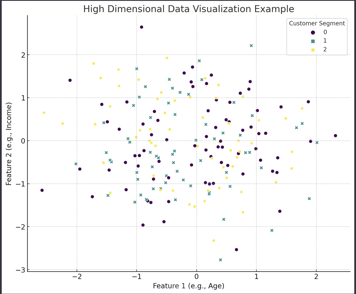
The scatter plot illustrates how data points, representing individual records in our dataset, are grouped according to 'Customer Segment' when viewed through the lens of just two features (e.g., Age and Income). This visual technique helps in identifying patterns or clusters among the data points, which are indicative of how different customer segments may exhibit distinct characteristics in terms of these two dimensions.
In simpler terms, the plot is a way to see how certain groups of customers (segments) might be similar or different from each other based on just a couple of aspects like their age and income. The colors and shapes in the plot help us quickly spot where each customer group lies on the chart, making it easier to understand complex data at a glance.
To dive deeper into high-dimensional data, beyond the two dimensions shown in the plot, we would use more advanced visualization tools that can handle many features at once. These tools allow us to explore the data in a more dynamic way, enabling us to select which aspects to view and how to interpret the relationships between different data points more comprehensively.
This approach to data visualization, especially with high dimensional data, is not just about making pretty charts. It's about making the data accessible and understandable, allowing us to see the stories that the data is trying to tell us. Through interactive dashboards and advanced visualization techniques, we can navigate through the complexity of high-dimensional datasets to uncover valuable insights and make informed decisions.
Before we delve into the how-to, let's clarify what multi-dimensional data visualization entails. At its core, it involves the representation of complex datasets with multiple variables in a format that is both accessible and understandable to users. This practice extends beyond the capabilities of traditional two-dimensional charts, requiring a more sophisticated approach to dashboard visualization that can include the technicalities of multi-layered data.
Selecting the Right Data Visualization Software
The foundation of any effective data visualization is the software used to create it. The market offers a myriad of data visualization tools, each with its unique strengths. When selecting the right data visualization software, consider factors such as usability, scalability, integration capabilities, and the variety of visualization options it supports. The goal is to choose a platform that not only facilitates the creation of dynamic, multi-dimensional visualizations but also simplifies the data analysis process.
Designing Your Multi-Dimensional Data Visualization Dashboard
A well-designed data visualization dashboard is instrumental in transforming raw data into actionable insights. We’re exploring a leading data visualization software, Grow BI tool for designing a multi-dimensional dashboard.
-
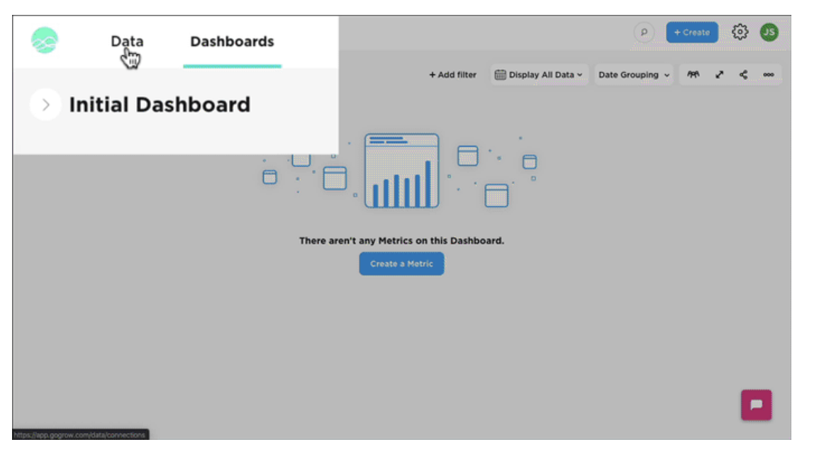
Start with Dashboard Creation: Upon logging into Grow.com, you're greeted with a user-friendly interface designed for building sophisticated data visualization dashboards. These dashboards serve as the foundation for what is data visualization in the context of multi-dimensional analysis.
-
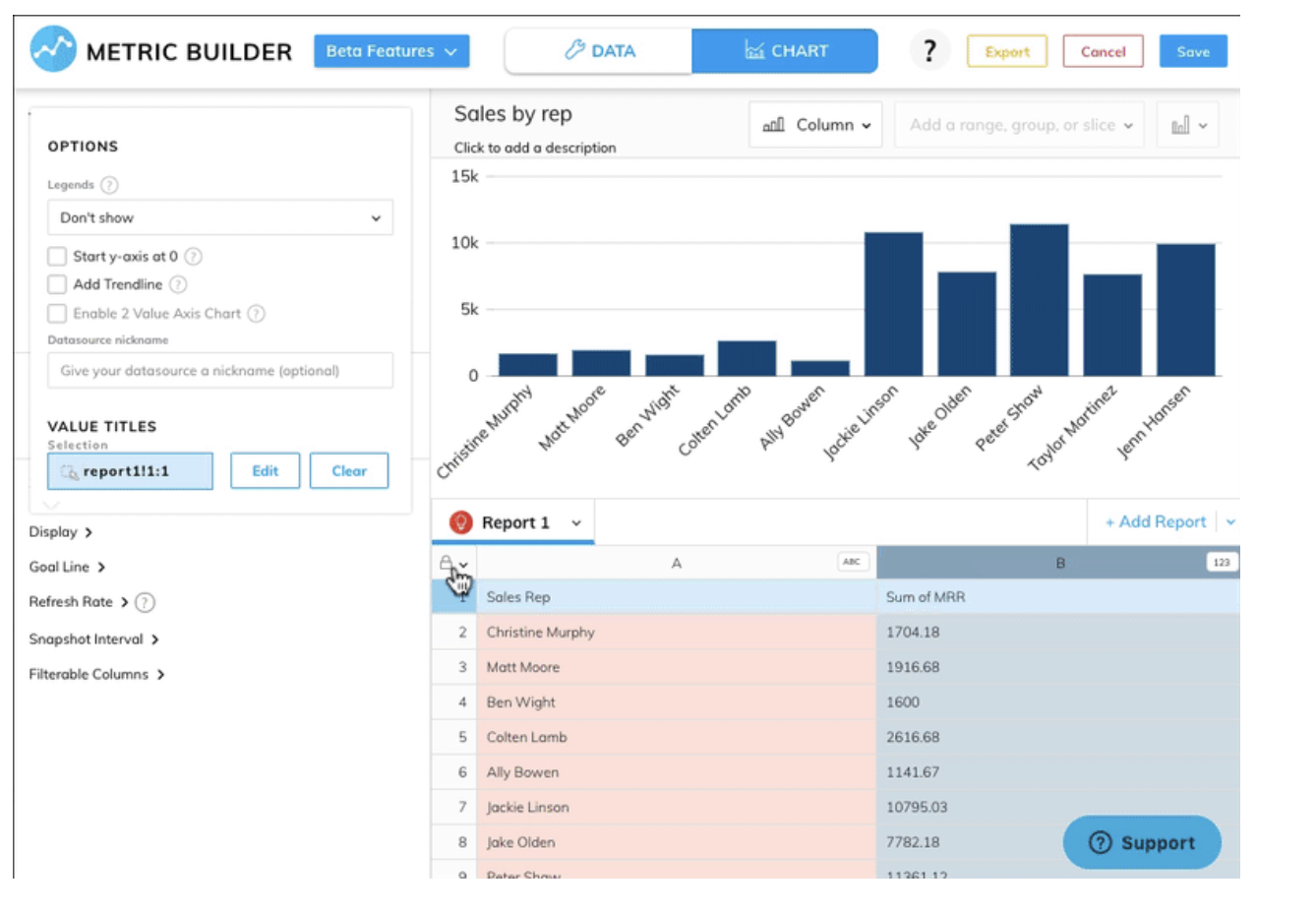
Utilize Customizable Widgets for Basic Charts: Grow BI tool allows users to select from a variety of widgets, similar to choosing a "Bar Chart" from the tools bar in other platforms. These widgets can be easily customized to represent different data metrics, including the ability to change chart types to best fit the data's story.
-
Incorporate Diverse Data Measures: By dragging and dropping different data measures onto your workspace, you can effortlessly create visualizations that compare various dimensions, such as time periods or user behavior. Grow’s interface simplifies adjusting data aggregation, similar to changing "SUM(registered)" to another aggregation type, enhancing the dashboard visualization's accuracy and relevance.
-
Enhance Visuals with Color Coding: Assigning colors to different measures or time periods is straightforward in Grow.com, facilitating at-a-glance analysis of trends and patterns within your high-dimensional data. This feature is invaluable for dashboard visualization, making complex data sets accessible and understandable.
-
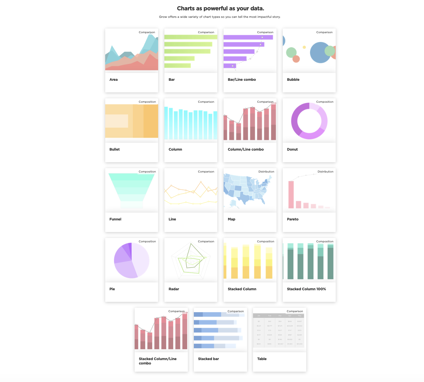
Switch Chart Types for Better Insights: Grow BI dashboard tool supports a wide range of chart types, allowing users to switch from bar charts to line charts (or any other format) with just a few clicks. This flexibility ensures that the chosen visualization method aligns perfectly with the data's narrative, highlighting trends and insights effectively.
-
Compare Data with Split Views: Comparing different data sets, such as registered versus casual users, is made simple with Grow software’s ability to create split or concatenated views. This capability is crucial for dashboard visualization, enabling users to juxtapose various data dimensions side-by-side for comprehensive analysis.
-
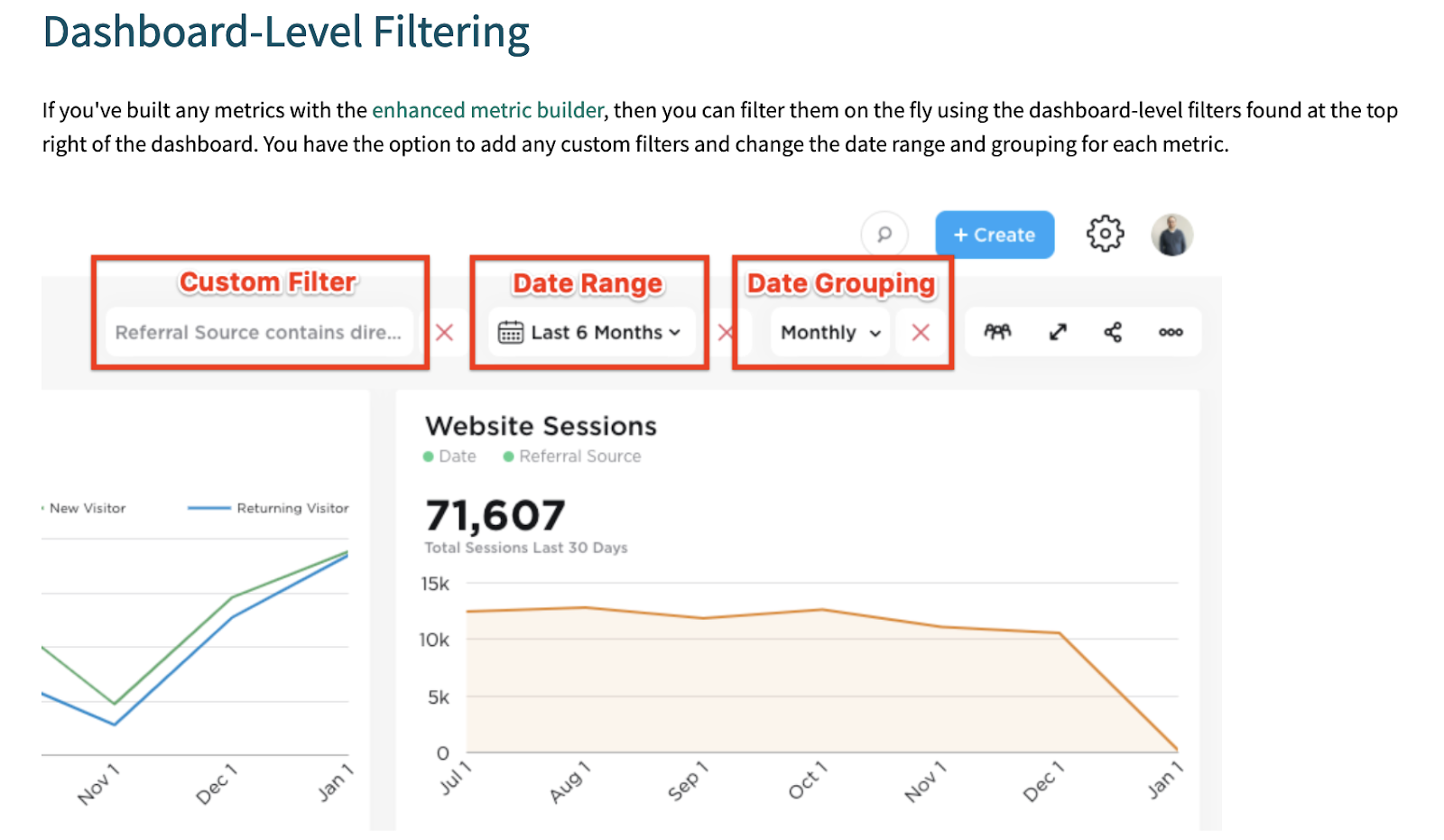
Explore Data with Interactive Tools: Grow’s exploration tools are designed for deep dives into data. Features like point-and-click interaction or brushing over data segments provide users with immediate insights, making it a powerful tool for uncovering underlying data patterns and trends.
-
Leverage Insights for Data-Driven Decisions: The platform's Explainer feature and other analytical tools offer actionable insights, assisting in understanding anomalies or trends within the data, such as investigating fluctuations in user registration numbers.
Best Practices for Multi-Dimensional Data Visualization
To maximize the impact of your data visualization dashboard, adhere to the following best practices:
-
Simplicity is Key: Avoid cluttering your dashboard with too much information. Focus on clarity and ease of understanding.
-
Consistency: Use consistent color schemes and design elements across your visualizations to maintain a cohesive look and feel.
-
Storytelling: Leverage your dashboard to tell a story with your data. A narrative approach can guide users through your findings, making complex information more digestible.
-
Accessibility: Make sure that all people, including those with disabilities, can see and use your visualizations. This includes considering color contrasts, text size, and alternative text for images.
Conclusion
Crafting effective multi-dimensional data visualizations blends art with science, demanding a deep understanding of your data, the use of appropriate data visualization software, and a strategic approach to design. This guide equips you with the insights to develop a data visualization dashboard that accurately presents complex data while engaging and enlightening your audience, showcasing the essence of what data visualization signifies in the modern, data-centric era.
The mastery of dashboard visualization is a dynamic journey. It encourages ongoing exploration of innovative tools, techniques, and best practices, ensuring you remain at the forefront of the rapidly advancing field of data visualization.
Grow, as a leading BI tool, exemplifies the capabilities required to create sophisticated multi-dimensional data visualizations. It offers a user-friendly interface, robust data integration features, and customizable dashboard options, facilitating the analysis and presentation of complex datasets. Grow's ability to seamlessly combine data from various sources into a single coherent dashboard makes it an invaluable asset for those looking to convey intricate data narratives effectively.
Embrace the future of data analysis with Grow BI—where data becomes decisions, and insights translate into growth. For a detailed look at how Grow can revolutionize your data visualization strategy and to stay updated with competitive pricing, check out 'Grow Pricing 2024 on Capterra'.
Article source: https://article-realm.com/article/Business/56910-How-to-Create-Multi-Dimensional-Data-Visualizations.html
Comments
Reviews

Most Recent Articles
- Oct 6, 2026 RBD Palm Olein Prices Rise as Q2 2026 Supply and Demand Shift by Rahul Gautam
- Oct 6, 2026 The Role of Heat Recovery Technology in Modern Cremation Equipment by Dipak Straits
- Oct 6, 2026 How Advanced Separation Technologies Are Transforming Scrap Processing by Dipak Straits
- Oct 6, 2026 ISO Certification: A Complete Guide for Businesses by Corpbiz Experts
- Oct 6, 2026 Patent Registration in India: A Complete Step-by-Step Guide by Corpbiz Experts
Most Viewed Articles
- 10662 hits Market Overview: Membrane Contactor Industry 2025 by Terra Logistics
- 8580 hits Mist Sprayer Pumps Market Demands, Trends, Industry Analysis, Segmentation by 2032 by ellamrfr
- 6778 hits Next-Gen Connectivity and the Rising Demand for RF Semiconductors by James Cameroon
- 5688 hits Digital Printing Packaging Market by Technology, Application, and Region by James Cameroon
- 4721 hits Flexographic Printing Plates Market Size, Share, Report 2024-32 by ellyse perry
Popular Articles
In today’s competitive world, one must be knowledgeable about the latest online business that works effectively through seo services....
81514 Views

Walmart is being sued by a customer alleging racial discrimination. The customer who has filed a lawsuit against the retailer claims that it...
62518 Views
Are you caught in between seo companies introduced by a friend, researched by you, or advertised by a particular site? If that is...
37322 Views

Facebook, the best and most used social app in the world, has all the social features you need. However, one feature is missing. You cannot chat...
23595 Views
If you have an idea for a new product, you can start by performing a patent search. This will help you decide whether your idea could become the...
14854 Views

Moving becomes easy when you have the right moving accessories. These moving accessories help secure and protect your item by ensuring that no harm...
13234 Views

A lot of us look forward to the result of moving and not the process itself. It is pretty typical behavior, though. As modern people, many things...
13163 Views

Building a custom home is an exciting adventure. It’s your chance to bring your vision to life and create an area that sincerely displays...
12923 Views

Moving from one state, city, or even to a whole different county, is something that is either dictated by choice or circumstance. This is because,...
11979 Views

A membrane contactor is a device that enables the transfer of components between two immiscible phases, typically a gas and a liquid, through a...
10662 Views
Statistics
| Members | |
|---|---|
| Members: | 17159 |
| Publishing | |
|---|---|
| Articles: | 79,625 |
| Categories: | 202 |
| Online | |
|---|---|
| Active Users: | 1518 |
| Members: | 0 |
| Guests: | 1518 |
| Bots: | 12173 |
| Visits last 24h (live): | 12234 |
| Visits last 24h (bots): | 92031 |


