Featured Articles

In today’s competitive world, one must be knowledgeable about the latest online bus...
Oct 12, 2018
Today, your online presence has become your ID card. If you don’t have a strong online presence, then there is no point. You may have a lot to lose. Moreover, gone are the days when having a dynamic-looking website was enough. At present, achieving success is only possible when you have a smartphone application, or even the least you can do is have a mobile version of your website. And this is something we will be discussing further in this post. Yes, here you will come across some of the best free responsive web design tools to take into account.
Now, what is a responsive web design? Well, with technology evolving at a breathtaking speed, there is no doubt that the web design and web development realms also seem to be evolving. In fact, the time has come when we might not be able to keep up well with endless innovations and resolutions. And most importantly of all, can you bear the consequence of losing your visitors even after working for days and nights, or should you opt for a small change? I guess the latter one is better!
Introducing the Concept of Responsive Web Design
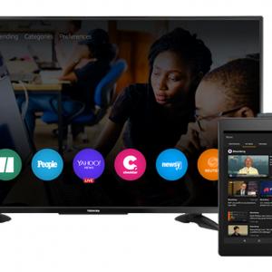
A responsive web design is an approach that ensures the particular design and development work wonders irrespective of the device. Whether it’s a blackberry or iPhone, iPad, or Kindle, a desktop, laptop, tablet, smartphone, and even a smart TV, all screen resolutions are highly compatible.
Now generally what happens is Responsive web design features CSS (Cascading Style Sheets) that assist well in serving a wide range of style properties irrespective of the screen size, resolution, color capability, and several other characteristics.
- Can you read the text without zooming in?
- Are there adequate spaces available for the tap target?
- Do you require horizontal scrolling?
Top Reasons for Considering Responsive Web Design
There is no denying that we live in a society where multi-screen technology has become the norm. So as a business you have to be seen across as many devices as you can be and smartphones are no exception here. In fact on that note, our tech giant Google announced that a website featuring mobile-friendliness and smooth user experience will definitely affect your rankings. Further, I would like to mention some other benefits of considering responsive web design.
#1 Minimized Cost
Beating up costs is not easy. And that’s the reason why most people aren’t ready to develop different sites for mobile and non-mobile audiences. Well, fortunately, we have a responsive design to the rescue. Here a lot of money can be saved by eliminating the cost of developing an entirely new website for mobile users. One single investment is all it takes and you can appeal to and gain the relevant attention of your end users in no time.
#2 Minimum Maintenance Required
Unlike other websites, responsive web design is something that requires a minimum amount of maintenance. Earlier, there were just a couple of options available in regard to maintaining a website.
#3 Effective Search Indexing
As mentioned earlier, search engines love responsiveness. After the mobile-friendly update was rolled out, people went crazy after creating mobile-friendly pages to rank better and in a shorter time span. Today, web pages do prefer to use high-readability text. The SEO ranking is extremely important, and here’s what one of the Google updates named Mobile geddon emphasized:
- This update mainly works for mobile searches
- Several factors such as the language of the website or the location do matter
- More or less the update focuses on page mobile-friendliness. Every web page must be mobile-friendly or else the non-friendly ones might appear in the later search results.
Apart from these, there are several other reasons, such as reduced page loading speed, no bounce rate, increased customer retention, better UI/UX, and whatnot! Basically, the times when you need to pinch or zoom in to see relevant information have become a little passe. Not having a responsive web design can certainly lead to a poor mobile experience.
Best Responsive Web Design Tools To Consider
#1 Fit Text
This one is a jQuery plugin. As the name implies, this particular responsive web designing tool has the potential to give flexibility to the existing font sizes. However, this particular tool works wonders for headings only and not for paragraphs. Now what the following tool does is display headings on the screen depending on the size of the screen visitors. Isn’t that cool? If you are looking for a unique plugin that is absolutely free and again easy to get started with, Fit Text is the name to take into consideration.
#2 Boot Strap
Front-end web development has never been so easy to get started with than in the present times. Bootstrap is a framework that makes website development extremely convenient and easy-going. In fact, it may quite interest you to know that all the features available in Bootstrap are highly recommendable for developing a responsive web design. Right from resizing the buttons to changing their colors, and adjusting their navigation bars, Bootstrap offers it all! Bootstrap is one such tool taken into consideration.
#3 Google Mobile-friendly Test
Creating a strong online presence is extremely important. Therefore, It is extremely important to come up with mobile-friendly websites. So make sure to create a site that is highly flexible and robust. Now have you tried Google’s mobile-friendly test? Well, here all you need to do is add the URL or code and once you hit the test button, everything will be well taken care of. These tests often point out any current errors, if any.
On and all, when deciding upon a specific responsive web design tool, don’t just pick randomly. Try evaluating your business needs and requirements in advance. Sometimes all you need is a free tool that can make a significant impact on your online presence and growth.
Final Thoughts
So you see, responsive web design is pretty these days! And not trending towards it could be a foolish move because everything is changing right from the search engines to your end user’s preferences. So we better keep at it. For that, you need to consider a reliable web development company that ensures the best possible solutions in adherence to the present changing scenarios and times.
Orginal Source Link: Click Here
Article source: https://article-realm.com/article/Computers/Software/30299-Best-Free-Responsive-Web-Design-Tools-in-2022.html
Comments
Reviews

Most Recent Articles
- Oct 13, 2026 Custom App Development Services in London for Your Business Needs by rskbusiness
- Sep 28, 2026 How Does AI Integration Enhance Offshore Product Development Efficiency? by rskbusiness
- Sep 24, 2026 IT Services for Mill Industry to Minimize Manual Production Reporting by Arobit Tech
- Sep 18, 2026 How AWS App Development Helps UK Startups Scale Quickly by rskbusiness
- Sep 17, 2026 Can Custom Logistics ERP Software Development Companies in India Improve Order Visibility? by Arobit Tech
Most Viewed Articles
- 6769 hits API Testing Interview Questions by Lucy Brudo
- 5425 hits What Is The Process Of Updating Garmin GPS Maps Free Of Cost? by Henry Ford
- 3277 hits Mit lokaler SEO Suchmaschinenoptimierung auf Platz eins! by BRIGHT DIGITAL
- 2434 hits Google Lighthouse- Auditing & Enhancing Shopify Theme Performance by Anuj Sharma
- 2388 hits How to Find Best Deals on www.amazon.com/code? by Patrika Jones
Popular Articles
In today’s competitive world, one must be knowledgeable about the latest online business that works effectively through seo services....
81605 Views

Walmart is being sued by a customer alleging racial discrimination. The customer who has filed a lawsuit against the retailer claims that it...
64071 Views
Are you caught in between seo companies introduced by a friend, researched by you, or advertised by a particular site? If that is...
37364 Views
Facebook, the best and most used social app in the world, has all the social features you need. However, one feature is missing. You cannot chat...
23645 Views
If you have an idea for a new product, you can start by performing a patent search. This will help you decide whether your idea could become the...
14901 Views

Moving becomes easy when you have the right moving accessories. These moving accessories help secure and protect your item by ensuring that no harm...
13270 Views

A lot of us look forward to the result of moving and not the process itself. It is pretty typical behavior, though. As modern people, many things...
13224 Views

Building a custom home is an exciting adventure. It’s your chance to bring your vision to life and create an area that sincerely displays...
12965 Views

Moving from one state, city, or even to a whole different county, is something that is either dictated by choice or circumstance. This is because,...
12088 Views

The report is titled as ‘Recombinant Cell Culture Supplements Market: Opportunity Analysis and Future Assessment 2022-2030’. An...
11870 Views
Statistics
| Members | |
|---|---|
| Members: | 17226 |
| Publishing | |
|---|---|
| Articles: | 79,838 |
| Categories: | 202 |
| Online | |
|---|---|
| Active Users: | 1426 |
| Members: | 1 |
| Guests: | 1425 |
| Bots: | 14102 |
| Visits last 24h (live): | 5859 |
| Visits last 24h (bots): | 47345 |


